Warm and cool colours: how they work in painting
Warm and cool colours are families used to describe visual temperature relationships. Reds, oranges and yellows are usually considered warm; blues and many greens and violets cool. Neighbouring colours, lightness, intensity and the areas they occupy modify that classification in a painting.
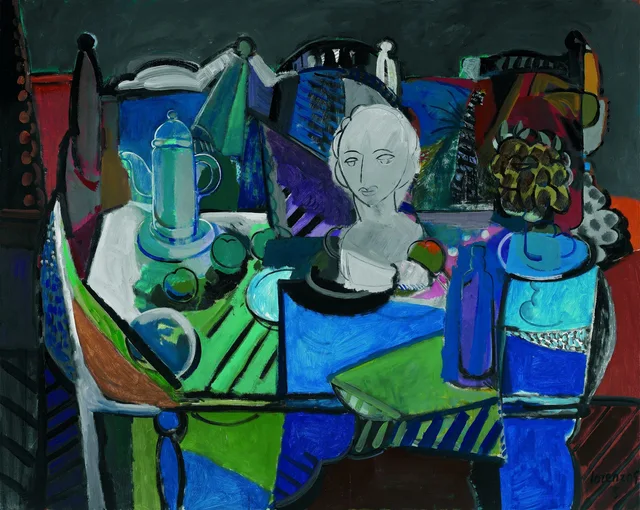
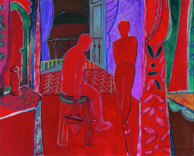
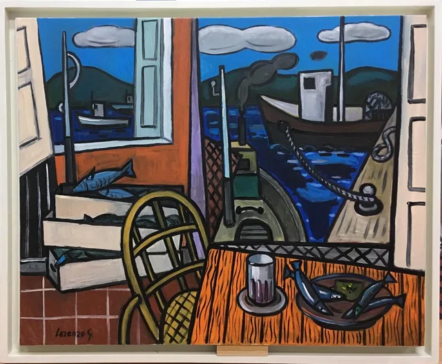
Bodegón de los tonos fríos, Interior rojo and Taberna en puerto de Vares offer three situations: a predominantly cool palette, an extensive red, and a contrast between orange interior and blue exterior. Naming colours is only the first step.
Temperature, value and saturation
Temperature describes a warm–cool relationship. Value concerns perceived lightness or darkness; saturation concerns chromatic intensity. Blue can be pale and muted, dark and intense, or relatively warmer than another blue.
These variables answer different questions. A light shape on a dark ground may stand out chiefly through value. Orange and blue areas of similar lightness give hue contrast more weight. Several contrasts often operate simultaneously.
Colorful Language, from the National Gallery of Art, introduces saturation, palette and complementary colours. This vocabulary is a starting point; a particular painting requires examining the relationships actually present.
Cool palettes can contain warm accents
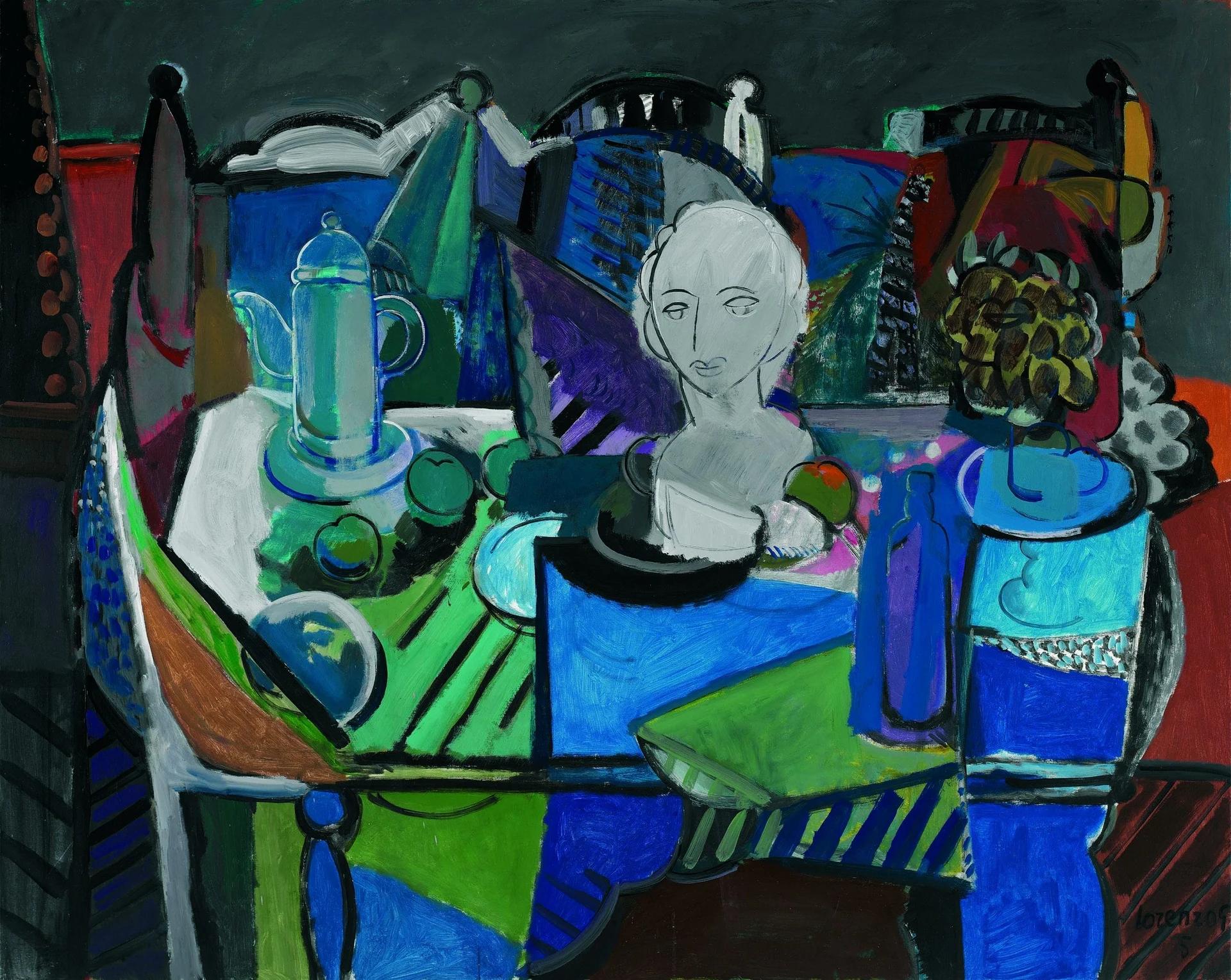
In Bodegón de los tonos fríos, blues, greens and violets occupy much of the table, vessels and background. A pale bust near the centre stands apart. Small reds and oranges appear among fruit, flowers and edges.
Area matters. A small warm accent need not change the painting’s dominant temperature, but it can interrupt continuity. Several accents distribute differences across an otherwise related palette.
The bust’s prominence is not primarily a matter of warmth. Its lightness and boundaries distinguish it from more intense and darker areas. Reducing the effect to warm–cool contrast would miss an important value relationship.
Red connecting bodies and room
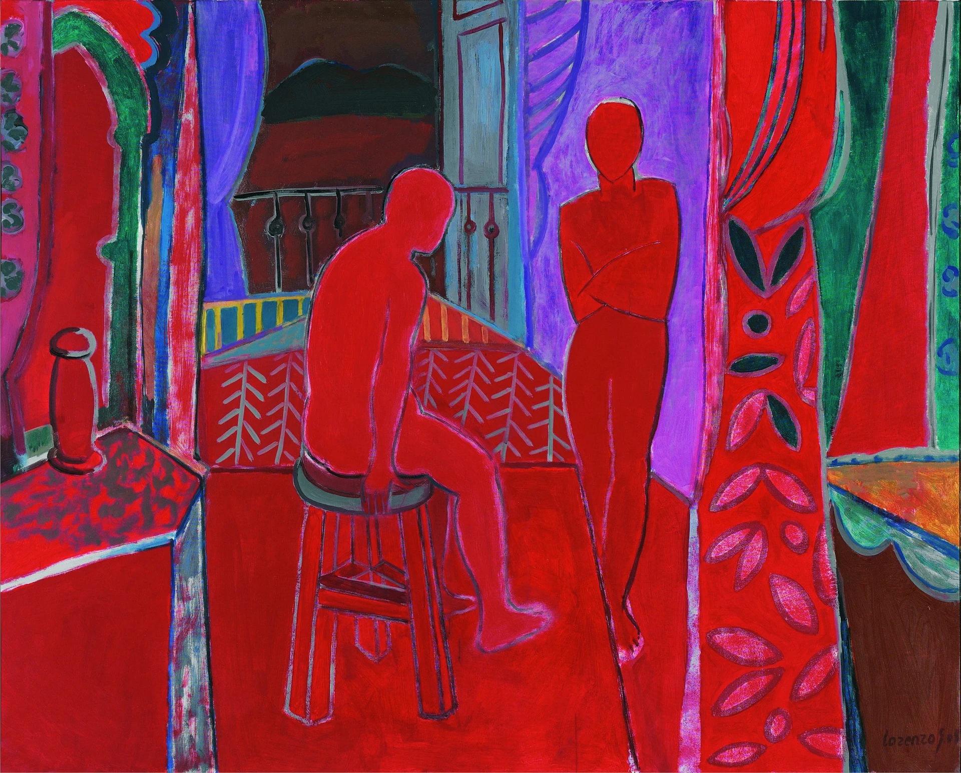
In Interior rojo, red spreads across floor, figures and interior surfaces, connecting elements recognised as bodies, furniture and architecture. Other devices must sustain their boundaries.
Violet behind the standing figure separates its silhouette. A light edge distinguishes the seated body from the similarly coloured floor. These are two ways of maintaining legibility within one dominant colour.
Greens at the sides and dark lines add variation. Dominant red does not mean a uniform surface or a single material red. Reproductions permit observations about colour relationships, not identification of workshop pigments or mixtures.
Blue and orange around a harbour view
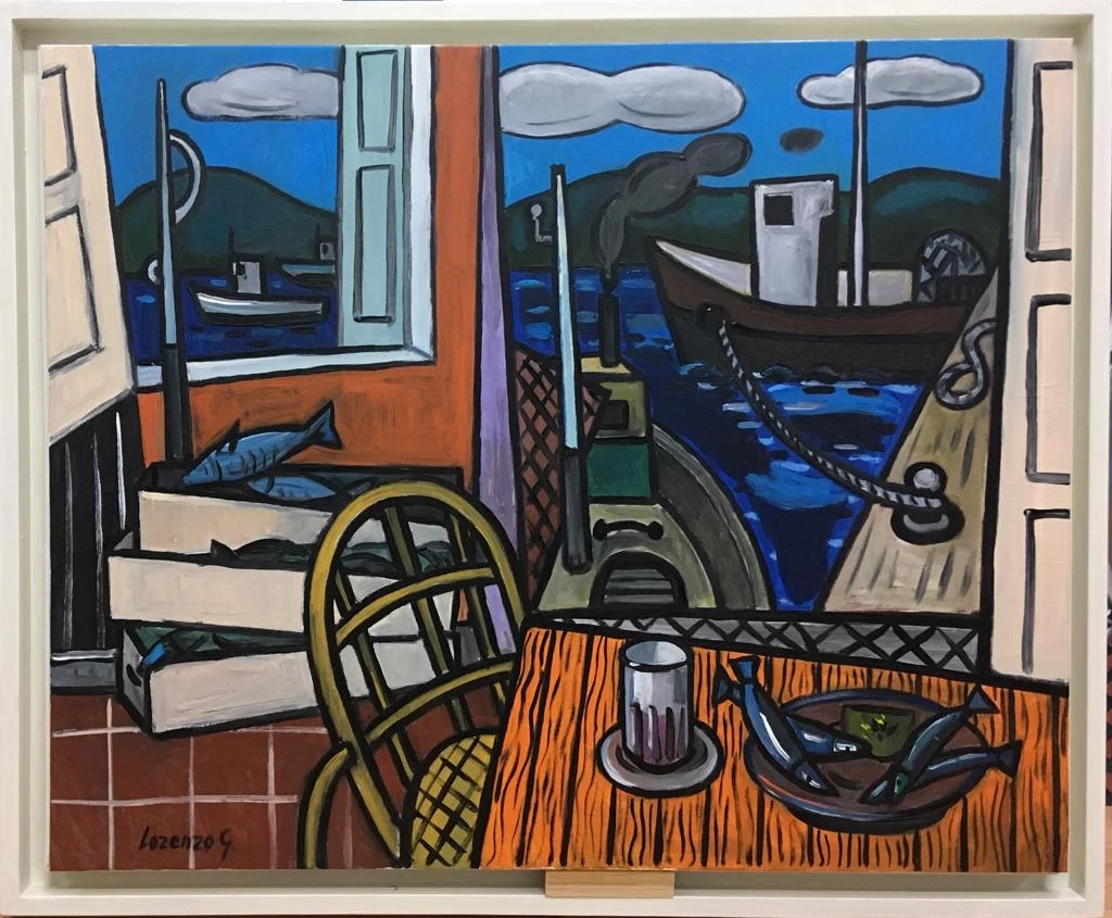
In Taberna en puerto de Vares, the table and part of the room are orange-toned, while blues dominate outside. Pale window frames separate the fields and sustain the distinction between room and maritime view.
Blue and orange oppose one another in the traditional colour wheel used in painting education. The National Gallery of Art explains this complementary relationship. Here it describes a broad opposition, not an exact pairing of every shade.
Tabletop, windows and objects also supply contours and directions. Colour’s effect depends on that structure. An isolated blue sample would not have the same relationship as blue enclosed by dark profiles and orange surfaces.
The traditional red–yellow–blue wheel is a teaching model. RGB light and CMYK printing use different primaries, so complementary pairs must be understood within the specified model. Analysing a painting is neither a mixing recipe nor a screen specification.
Temperature does not dictate depth
The familiar proposition that warm colours advance and cool colours recede can be a useful first approximation. Position, edges and overlap may change the reading. A blue shape covering another can appear in front despite belonging to a cool family.
The tavern’s exterior is identified through windows, boats and quay. Colour reinforces the division alongside those cues. In Interior rojo, contours and overlaps maintain depth within a widely shared palette.
The perspective article explains how such cues combine. Temperature is one analytical tool, not a substitute for spatial observation.
Describing colour precisely
Start with the dominant families and the areas they cover. Locate accents and compare their extent. Then distinguish temperature, value and saturation contrasts, specifying where each occurs.
The cool still life concentrates lightness contrast in the bust. Interior rojo uses contours to separate chromatically similar areas. The tavern distributes warm and cool colours between room and harbour, with frames organising their encounter.
Photography and screens can alter colour; these observations concern archive reproductions. The complete catalogue images and the composition guide allow further study. Precision means explaining a visible relationship before attaching an emotional meaning to it.
Observation exercise: compare the same colour
Place identical grey cut-outs on orange and blue paper under the same light. Compare their appearance. Return to Bodegón de los tonos fríos and select a warm accent: describe its extent and neighbouring colours before attributing a sense of nearness or distance to it.
Sources and references
These sources support the technical concepts. The readings of individual works are editorial interpretations of the linked reproductions.