Pictorial composition: how to analyse a painting
Pictorial composition is the organisation of forms, colours, directions and intervals within an image. Analysing it means explaining relationships rather than simply listing objects. A small area can command attention through contrast; repeated lines can connect distant parts of the picture.
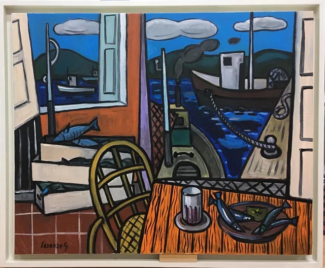
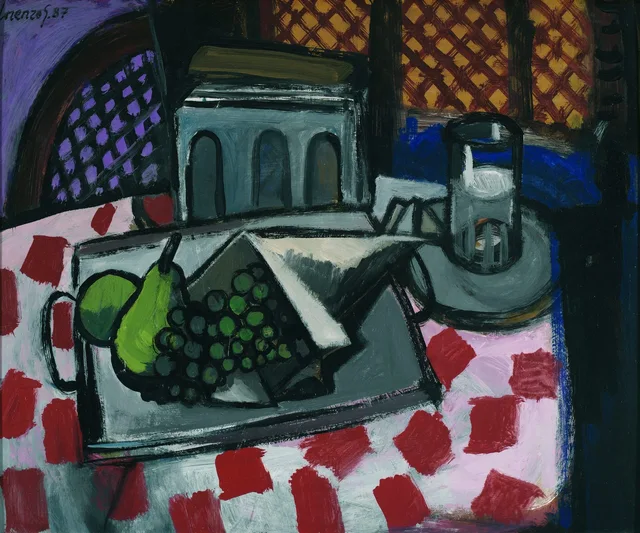
Taberna en puerto de Vares and Bodegón de la tostadora, by Lorenzo González Sánchez, offer concrete problems: an interior divided by windows and a table of closely grouped objects. Distinguishing hierarchy, balance and rhythm helps explain both arrangements.
From format to large masses
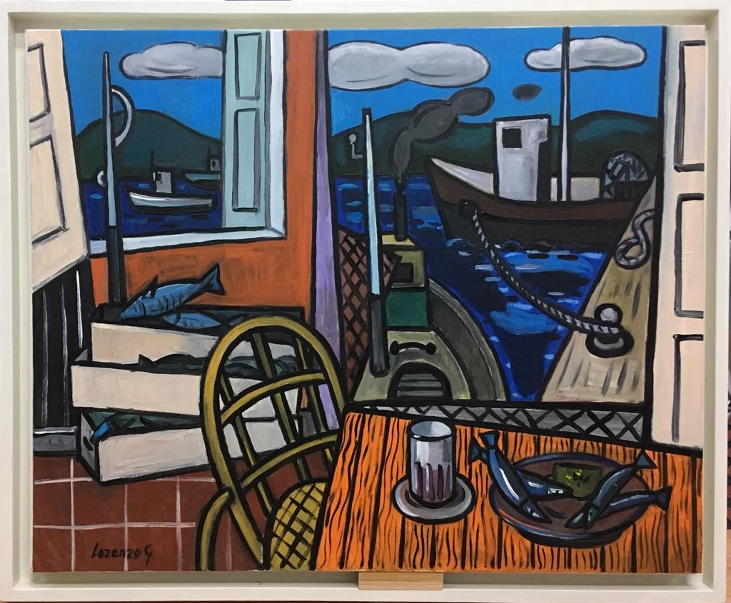
The format establishes a boundary: the rectangle containing the visible relationships. Before identifying each object, locate the main light, dark and coloured masses. Different elements may read as one unit from a distance.
In Taberna en puerto de Vares, exterior blues occupy much of the upper half. An orange table extends across the foreground, while chair and boxes articulate the left side. Upright frames subdivide the field and separate harbour views.
This first scheme prevents the small glass or plate from absorbing all analytical attention. Their roles belong to a larger distribution. Identifying masses first helps explain why a detail stands out or remains subordinate.
Hierarchy and contrast
Visual hierarchy concerns the relative perceptual prominence of elements. Size, position, contrast and isolation can contribute. Getty’s descriptive vocabulary distinguishes emphasis, balance and rhythm as ways of discussing these relationships.
The large window and boat gather broad forms and dark profiles against blue. In front, the light glass introduces a short vertical on the table. Though smaller, it remains easy to locate because of value difference and surrounding space.
Emphasis does not mean every viewer looks there first. Attention varies with distance, reproduction size and individual interests. Analysis describes visible conditions that may encourage a reading; it does not reconstruct a measured eye movement.
Balance without symmetry
Visual weight is relational, not a physical mass or a single numerical measurement. A large area can be balanced by a smaller but more contrasting one. Texture, edges and proximity to the picture’s boundary also matter.
The tavern’s openings differ in size. The smaller window sits above boxes beside the chair; the larger contains boat and quay. Concentrated objects on the left and the expansive view on the right support a reading of asymmetric balance.
A golden-ratio overlay is unnecessary. A geometric scheme is useful only when it explains something observable without shifting lines until a desired coincidence appears. Actual boundaries, masses and directions already provide evidence.
Directions connecting areas
A direction may arise from a table edge, a figure’s axis or a painted line. Verticals can establish divisions, diagonals connect displaced positions, and curves enclose or link forms. Their effect depends on the whole.
In the tavern, vertical frames contain the exterior. The curved mooring rope crosses boat and quay, while the chair’s arched back introduces another curve indoors. Comparing these different objects reveals correspondences within the image.
In Bodegón de la tostadora, the tray’s oblique edge contrasts with the glass’s more upright presence. The tilted tabletop supports both directions. The objects’ order arises from their combination rather than a uniform alignment.
Rhythm, pattern and interval
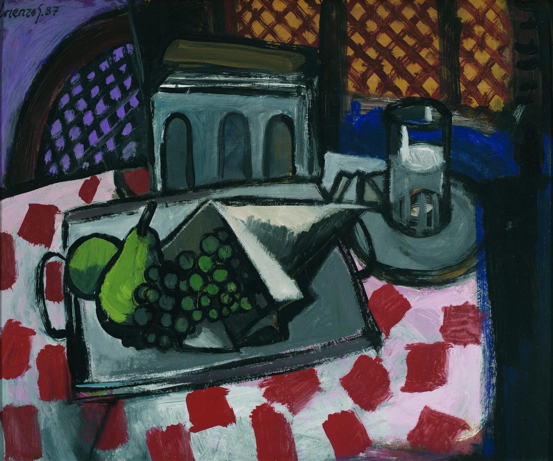
Visual rhythm arises when repetition introduces continuity and variation in contours, colours, shapes or spaces. A pattern is a more localised repetition, such as a grid or diamonds; it may contribute to an overall rhythm without covering the whole painting.
The tablecloth repeats red shapes on a pale ground. Background lattices introduce smaller diamonds. Their different scales distinguish the areas, while repetition connects their surfaces.
Between them, the toaster’s block and the vessel on the right offer a different density of information. Intervals distinguish marked areas from broader masses. The still-life guide follows the table-and-object relationship in detail.
A method for writing the analysis
Begin with format and main masses. Locate the strongest contrasts, compare the weight of areas, then trace directions and repetitions. Finally, explain an effect and identify the evidence supporting that interpretation.
“The composition is balanced” needs elaboration. In the tavern, the concentration of chair and boxes on the left counterbalances the breadth of the right opening. In the still life, patterns distribute activity between tablecloth and background. An adjective becomes informative when its mechanism is specified.
Perspective and warm and cool colour relationships develop parts of that reading. Composition brings them together through a distinct question: how do the parts of this particular image work together? The complete reproductions let the reader check each observation.
Observation exercise: three values
Make a small study of Taberna en puerto de Vares using only white, grey and black. Group areas by approximate lightness and omit details. View it from a distance: where is contrast concentrated? Compare that area with what attracted attention in the colour reproduction. The difference helps distinguish value from hue.
Sources and references
These sources support the technical concepts. The readings of individual works are editorial interpretations of the linked reproductions.