Perspective in painting: depth and planes
Perspective in painting encompasses ways of representing spatial relationships on a surface. Lines converging towards vanishing points offer one solution. Overlap, relative size, changes in contrast and the arrangement of planes also help us read depth.
Several paintings by Lorenzo González Sánchez combine cues to a room or table with strongly present colour surfaces. Distance remains recognisable without requiring every part of the scene to obey one projection system. The task is to observe how each relationship is constructed.
What linear perspective explains
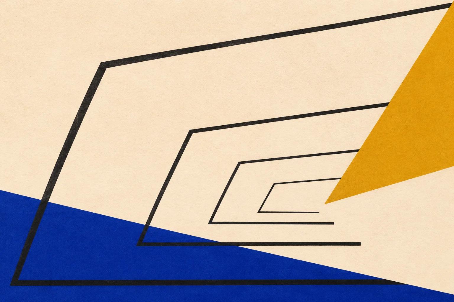
Linear perspective represents apparent diminution and convergence from a particular viewpoint. In a one-point scheme, a set of parallel lines receding in one direction converges towards that point in the image. Other arrangements use two or three main points, according to the orientation of objects and viewpoint.
The National Gallery glossary explains depth on a flat surface. Viewpoint is integral to the problem: a table seen from above offers different relationships from one seen almost at its own height.
To identify a linear construction, follow comparable directions, such as several architectural edges. One diagonal does not prove a complete system. Nor must every figurative painting have a single vanishing point.
Overlap establishes before and behind
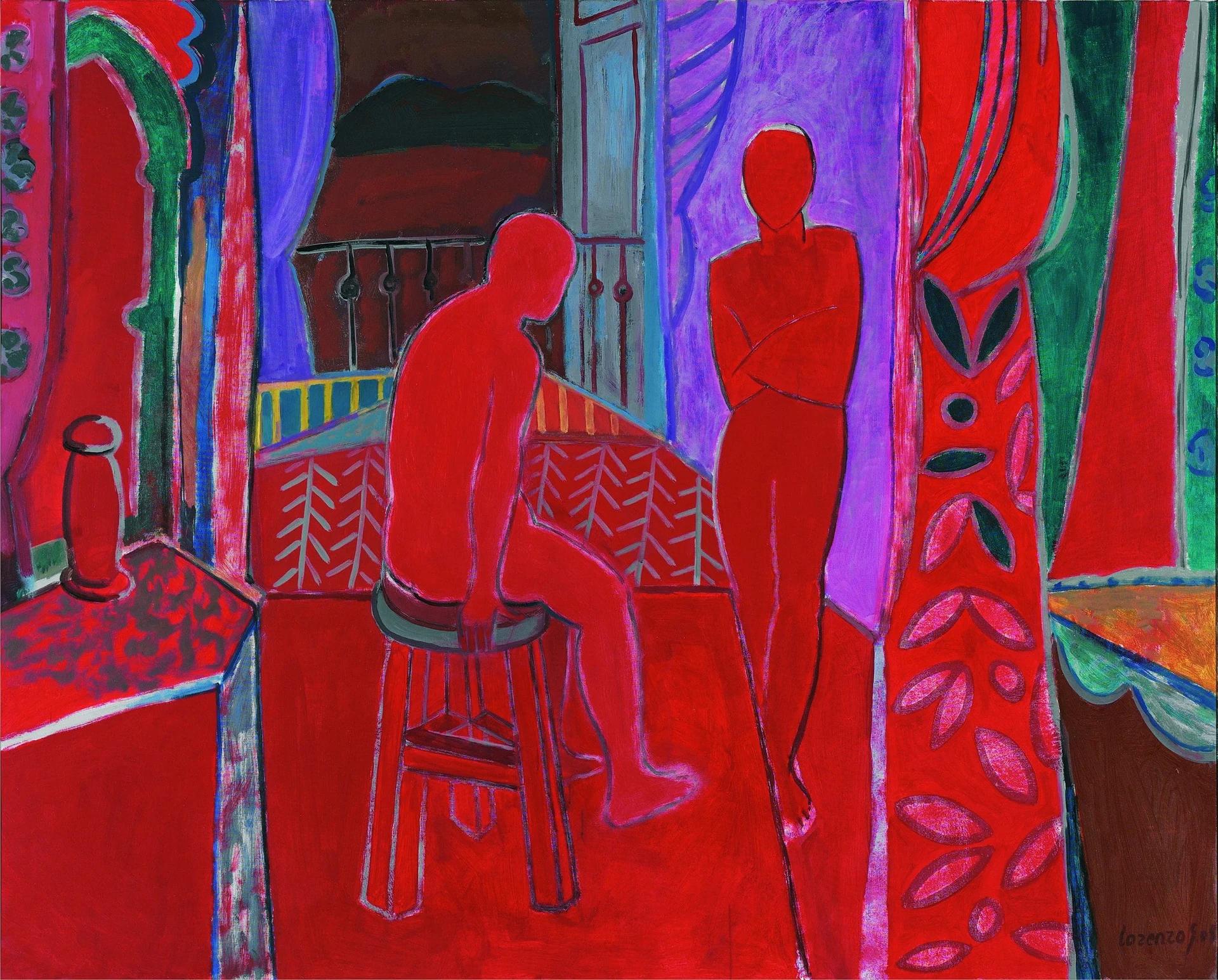
When one shape interrupts another’s contour, we can read it as closer. This occlusion establishes spatial order without measuring an exact distance. It can work with flat colour and little modelling.
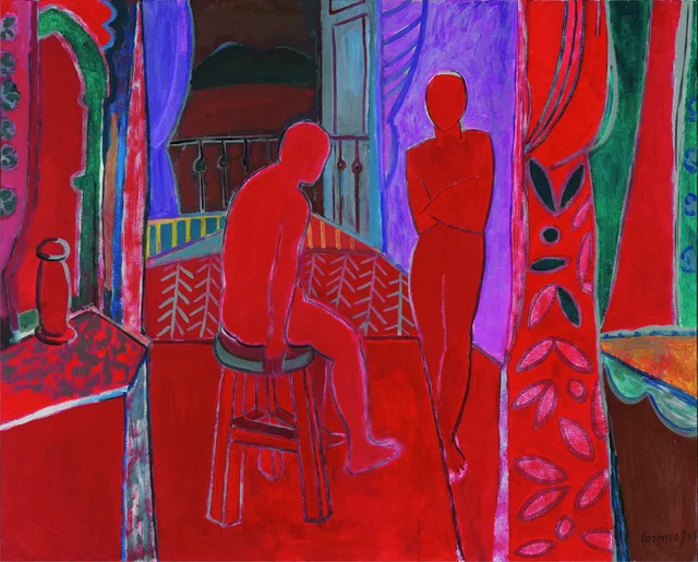
In Interior rojo, the seated figure occupies space in front of the rear opening. The stool reads beneath the body; side surfaces bound the room. Their relative positions maintain a spatial organisation even while red connects body, floor and other planes.
Two questions remain distinct: what is in front, and how far away is it? Contours and overlaps help answer the first. The second remains less certain because red continuity and local differences between planes resist turning the scene into a measurable room.
The tilted table in still life
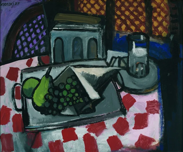
In Bodegón de la tostadora, the table tilts towards the picture surface. Much of the cloth and tray’s contents is visible, while the toaster’s front preserves its dark arches. The objects offer information from orientations that make them legible.
Tilting gives a horizontal surface greater visual presence. Objects approach the edge and depth compresses. Describing that compression is more precise than mentally correcting the table to match a photograph taken from one position.
The Met’s Cézanne essay provides historical context for still lifes in which object relationships take precedence over single-point perspective. The comparison does not establish a specific lineage or reconstruct Lorenzo’s working process.
The window as plane and opening
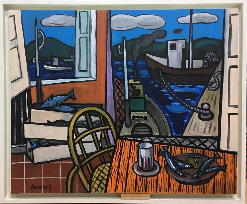
A window shows exterior space within a room, but its frame also describes a geometric shape on the painting’s surface. Suggested distance and the rectangle’s frontality can operate together.
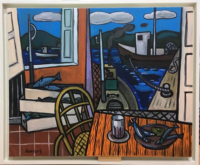
In Taberna en puerto de Vares, the larger opening shows a fishing boat and quay; the foreground table carries glass and fish. Frames separate these areas, while strong blue and orange surfaces retain their presence as areas of the picture.
The mooring rope links boat and quay, passing in front of several forms. Its path can be followed without treating the entire painting as a geometric projection. Several depth cues coexist within a field strongly organised by edges.
Colour, contrast and distance
The National Gallery’s account of aerial perspective describes changes in contrast, definition and colour that suggest distance. Distant landscape elements often appear less contrasted or distinct. This differs from geometric convergence, though both devices can coexist.
Blue does not always mean distance, nor must warm areas advance. Overlap and size contribute too. In the tavern, the blue exterior is identified through windows and boats; its spatial relationship depends on the combined cues.
In Interior rojo, shared colour draws body and room together visually. Contours and overlaps restore distinctions. The colour article discusses these relationships without treating them as invariable laws.
Analysing pictorial space
Identify foreground, intermediate planes and background, then state what supports that separation: interrupted edges, size differences, converging lines, frames or contrast changes. If one cue contradicts another, the tension belongs to the painting too.
The still life’s tilted table exposes its objects while reducing distance. In Interior rojo, colour joins surfaces that silhouette separates again. In Taberna en puerto de Vares, windows contain the view and divide the field. Each work combines devices differently.
Ask how that combination is articulated and what it lets us see. Composition adds a broader scale: how spatial relationships contribute to the image’s balance, directions and rhythm.
Observation exercise: ordering planes
In a study of Interior rojo, identify three overlaps. Mark which contour interrupts another and which area appears in front. Then trace edges suggesting recession. If they do not converge at one point, describe the difference without correcting it: the exercise is to understand this particular pictorial space.
Sources and references
These sources support the technical concepts. The readings of individual works are editorial interpretations of the linked reproductions.