Figure and ground: contour and negative space
Figure–ground relationships explain how we distinguish a shape from its surroundings. They do not only separate a person from a room: a jug, boat or abstract patch can also function as a figure. The ground contributes to its definition and may be as visually active as the main subject.
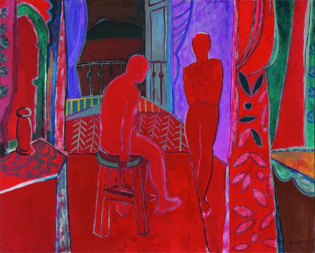
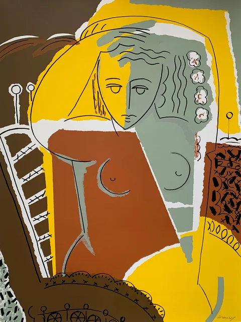
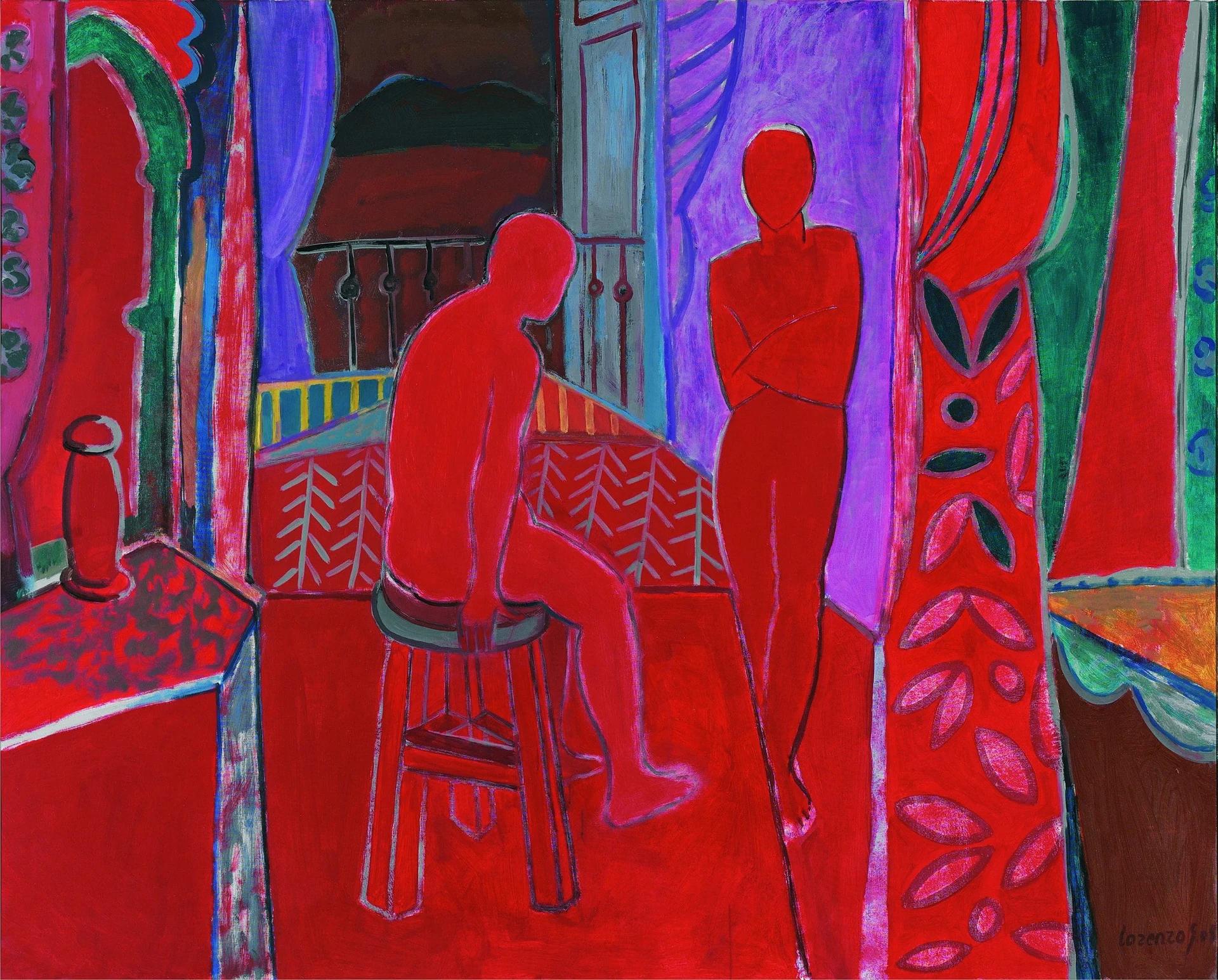
Interior rojo and Sara, by Lorenzo González Sánchez, offer two solutions: a body sharing the red of its surroundings, and a figure articulated through colour fields and line. This reading concerns archive reproductions; it does not reconstruct exercises taught by the artist.
Figure, ground and negative space
Figure names a shape that we recognise as a distinct unit in a particular relationship. Ground is the field against which it appears. Negative space refers to areas around and between forms: observing them helps establish distances, proportions and placement.
Getty’s vocabulary distinguishes shape and space. Its exhibition The Poetry of Paper examines how undrawn areas can help suggest forms. That possibility does not imply that every pictorial ground is unpainted: negative areas can be covered in colour.
An edge is a relationship
A boundary can arise from a line, a difference in lightness, a colour change or an interrupted texture. Edges need not all have the same intensity. Compare both sides and identify what makes them distinct.
In Interior rojo, the standing figure is outlined against violet. The seated figure shares the floor’s red, but a light contour and the stool’s structure help distinguish it. These are different devices within one painting. Assigning a psychological meaning to red is unnecessary to describe them.
Looking at the gaps in Interior rojo
Instead of beginning with anatomy, follow the space between the figures, the stool’s edge or the opening behind them. These areas have width, direction and changing contours. Drawing them requires comparison and prevents treating bodies as isolated elements.
The ground is active: curtains, railing and patterns introduce their own rhythms. The human silhouette is read against that activity. Figure and ground need not correspond to an empty background or different material layers.
Sara: line and colour do not always coincide
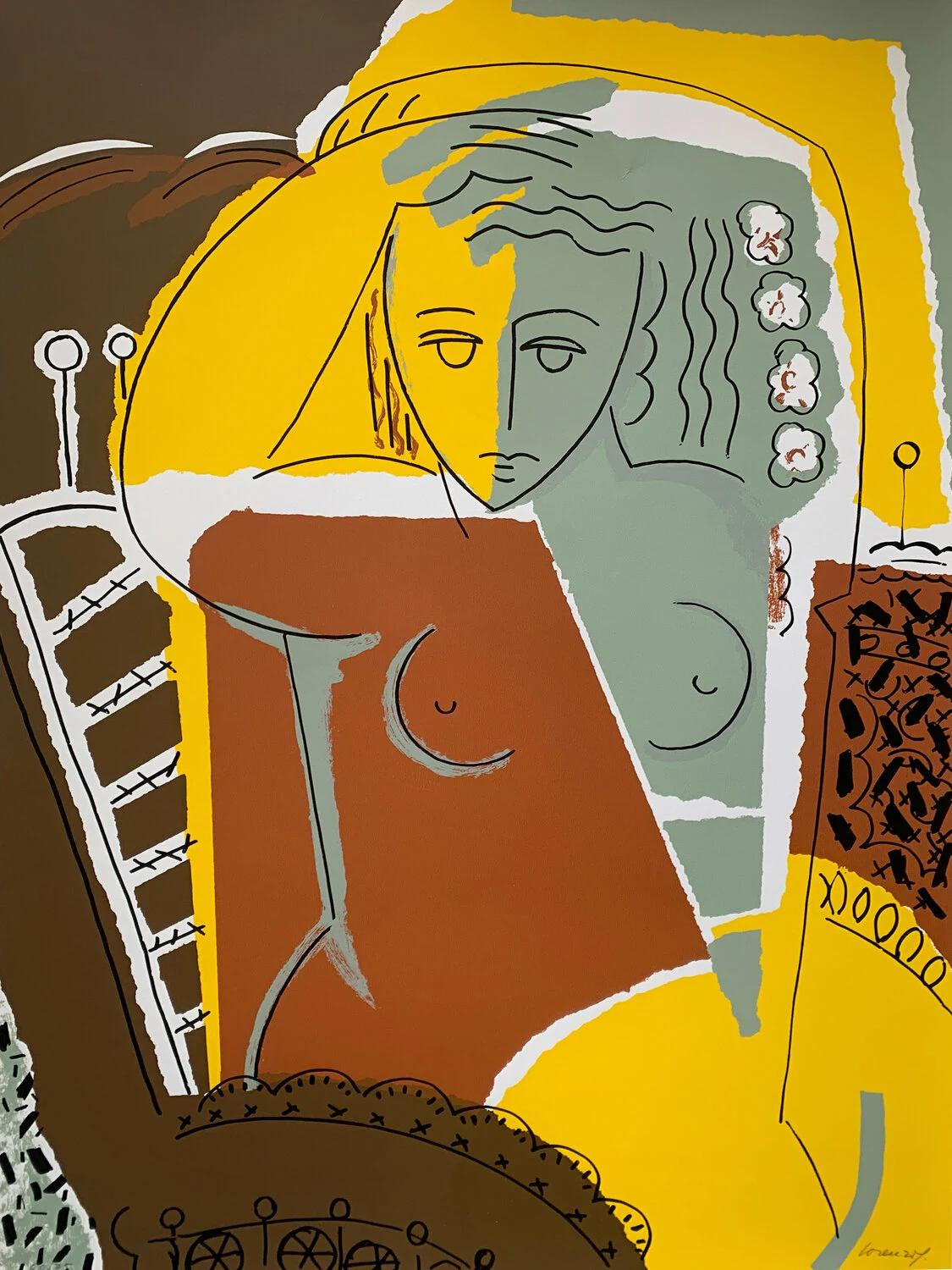
In Sara, the raised arm and part of the head share yellow. Dark lines specify features and traverse the body, while other fields cross areas recognised as figure and surroundings. Recognition depends on cooperating cues rather than exact correspondence between every patch and object.
The catalogue identifies the work as a screenprint from the Mujeres series. Formal analysis cannot establish its screen count or inks. The screenprinting guide distinguishes those technical questions.
Exercise: draw the spaces between forms
Make two small studies of Interior rojo. In the first, draw only the bodies’ silhouettes. In the second, retain adjacent spaces and leave the figures empty. Compare the inclination of boundaries and the proportions of areas.
The exercise tests relationships of placement, not viewers’ attention objectively. If separation proves difficult, identify the specific edge and explain whether similar colour, overlap or dense marks are involved. Pictorial composition places that relationship within the whole.
Sources and references
These sources support the technical concepts. The readings of individual works are editorial interpretations of the linked reproductions.