Still life: composition in contemporary painting
A still life centres on inanimate objects: fruit, vessels, food, flowers or utensils. In painting, these subjects provide a particularly clear way of studying composition. A table holds recognisable objects, but it also distributes verticals, curves, intervals and patches of colour within the picture rectangle.
In Lorenzo González Sánchez’s still lifes, that construction remains visible. The tabletop tilts, contours separate objects and patterns connect foreground and background. Examining their relationships shows how an enduring genre continues to investigate space through everyday things.
What defines a still life
The Spanish terms bodegón and naturaleza muerta commonly refer to this genre. Objects are central, although a painting may combine a table with a room, window or figure. Classification guides observation without requiring every work to fit a closed category.
A painting of fruit may examine volume, texture, symbolism or relationships between shapes. None of these functions follows automatically from the subject. Interpretation requires looking at the painting and, where appropriate, consulting its documentation.
MoMA’s selection of still lifes, including works by Cézanne, Morandi and Wesselmann, demonstrates the genre’s diversity. Here the focus is on two paintings in Lorenzo’s archive and on visible relationships between their objects.
Everyday objects as structure
A bottle introduces a vertical; a tray encloses a group; a fruit may link two areas through colour. This formal description complements the inventory of depicted things. Having identified an object, we can ask what its shape does within the composition.
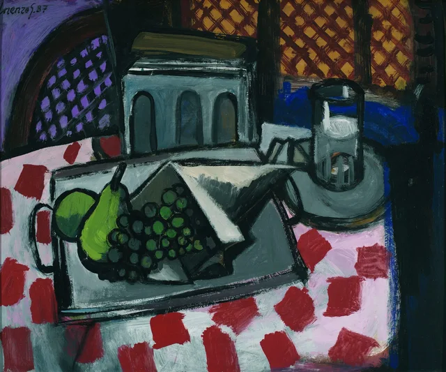
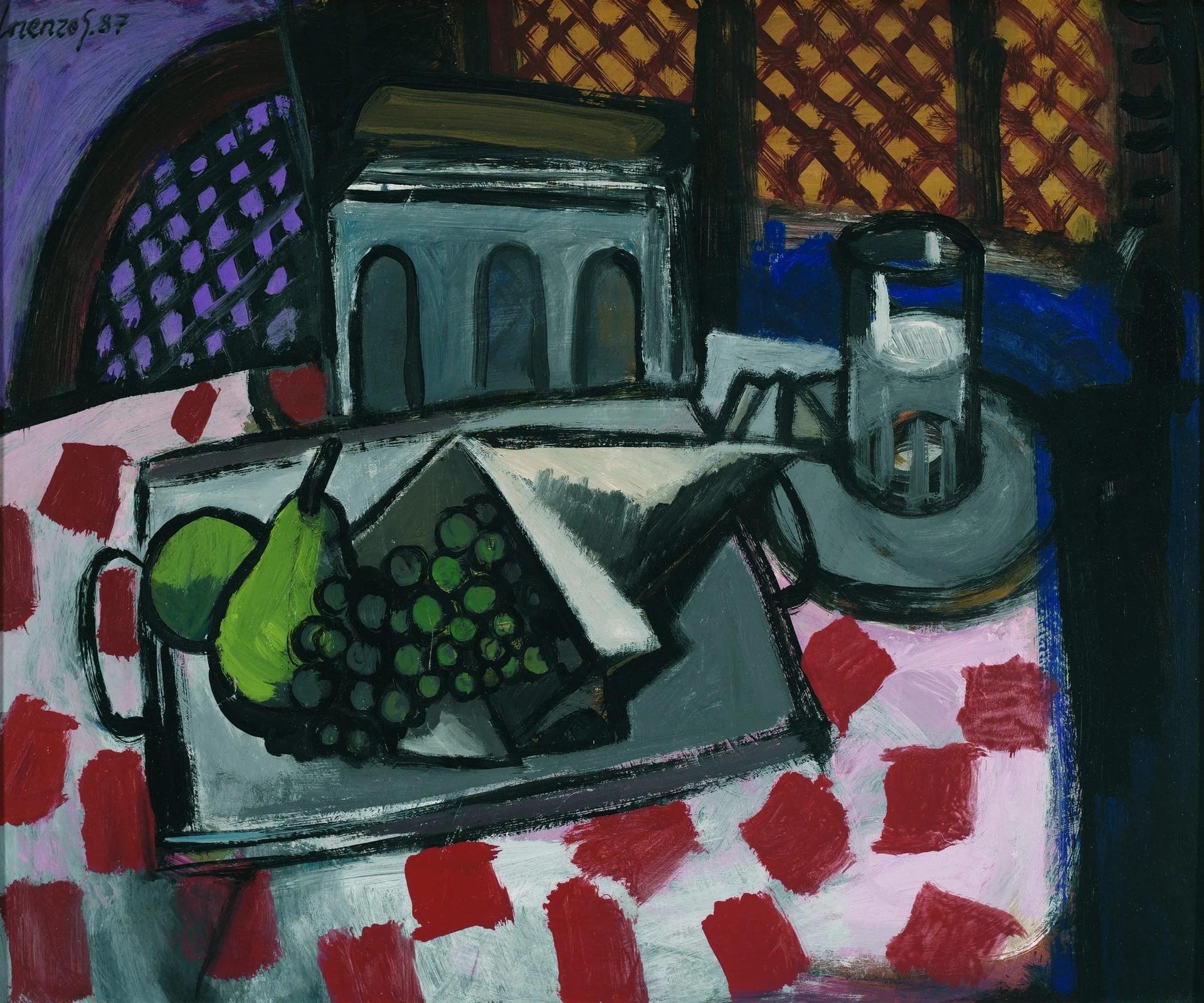
In Bodegón de la tostadora, an oil on canvas, the toaster occupies the upper part of the table as a grey block with dark arches. A tray gathers fruit and angular forms in front; to the right, a glass rises above a plate. These groups remain distinct despite the compressed space.
The domestic appliance therefore supplies more than a reference to daily life. Its block-like volume contrasts with the grapes and pear, while the arches repeat within its front face. Observation moves from naming an object to explaining its formal role.
The tilted tabletop and depth
A tilted plane presents a surface understood as horizontal more openly towards the picture plane. Here we see much of the tray and tablecloth, while the toaster retains a frontal presence. The table seems to lift its contents towards us.
This arrangement compresses the distance between the lower edge and the background. Objects overlap, but recession does not depend solely on lines converging at one point. The tray’s inclination, the plate and the dark masses establish local spatial relationships.
The Metropolitan Museum’s essay on Cézanne discusses how relationships between objects can take precedence over single-point perspective in his still lifes. This offers historical context for a pictorial problem; it neither proves a specific influence on Lorenzo nor assigns his work to a historical movement. The article on perspective examines the spatial devices separately.
Patterns, contours and intervals
Red marks lie across the white and pink tablecloth. Behind them, diamond patterns occupy violet and ochre areas. Their scale and direction differ, yet repetition links the front and back of the painting.
Dark outlines enclose the tray, fruit and glass, keeping neighbouring shapes legible. Where masses are dark, lighter edges and colour changes help distinguish them.
Intervals matter too: the space between glass and toaster, or between tray and picture edge. Merely listing the objects overlooks gaps that affect the composition’s density. A narrow interval compresses; a more open area gives the eye room between forms.
Organising a cool palette
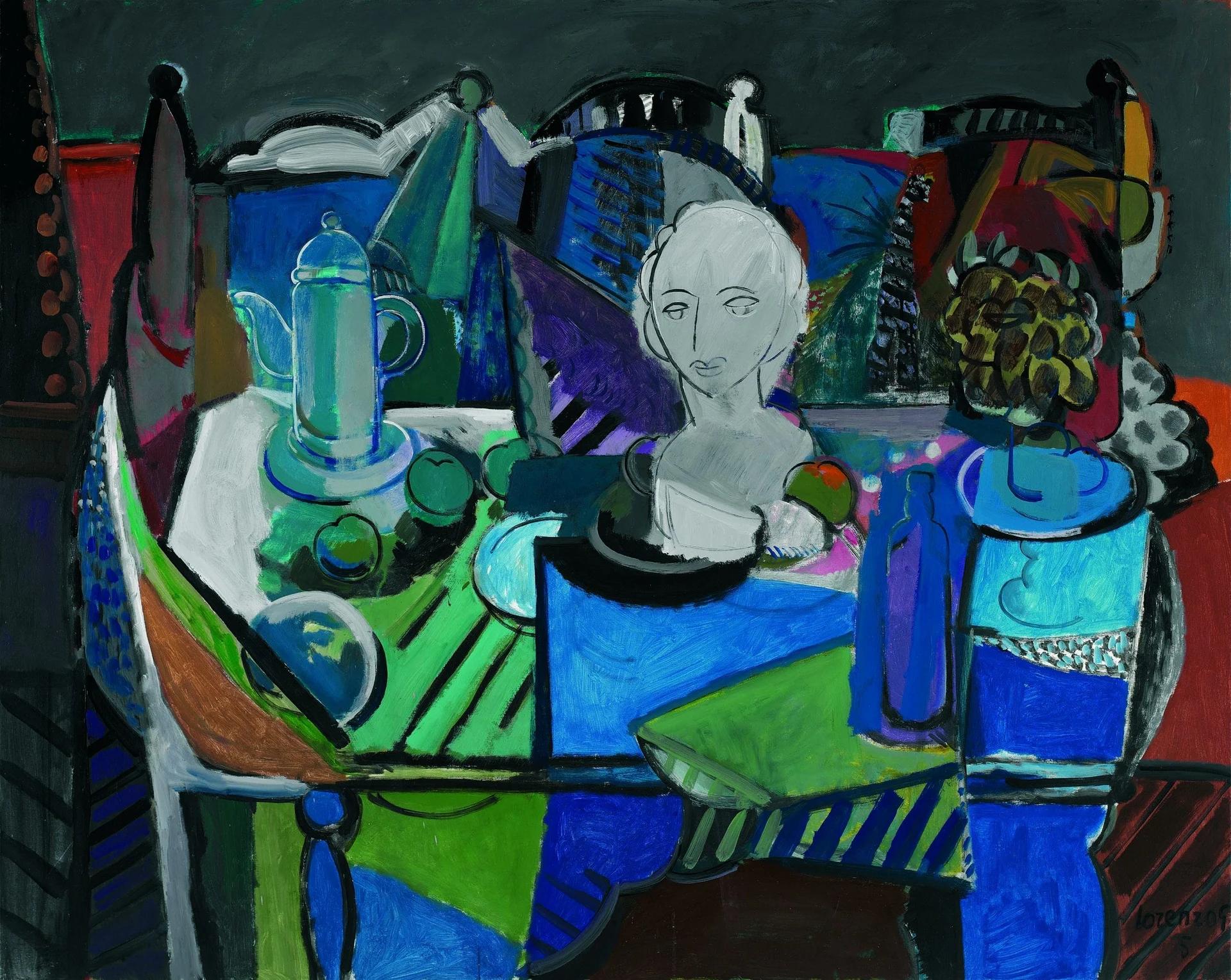
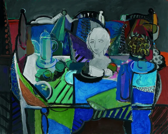
In Bodegón de los tonos fríos, also oil on canvas, a pale bust occupies the central area among vessels, fruit and flowers. Blues, greens and violets extend across the table, objects and background, interrupted by small reddish and orange accents.
The bust stands out through lightness. The blue bottle on the right extends a vertical within an already blue area. Their visual roles differ: a technical reading distinguishes value contrast, light against dark, from contrast between colour families.
Tablecloth bands and black profiles separate planes. A restricted palette need not produce uniformity: proportions, directions and intensity vary across it. The warm and cool colours guide develops this distinction.
Looking at a contemporary still life
After identifying the subjects, ask what supports them, where emphasis gathers, how they remain distinct and which repetitions connect the parts. This is more precise than immediately assigning symbolic meanings to every fruit or vessel.
Bodegón de la tostadora brings blocks, curves and patterns together on a tilted table. Bodegón de los tonos fríos groups diverse objects within a palette interrupted by the light bust. Comparing these devices explains each painting more effectively than applying one general label.
The linked catalogue entries show complete reproductions. From there, the painting archive offers further comparisons of table, contour and colour.
Observation exercise: change an interval
Arrange three objects of different heights on a table and draw only their silhouettes. Repeat the arrangement after moving the central object a few centimetres. Compare the gaps, distribution of masses and relationship to the edges. The aim is to test how a single distance changes the composition, rather than to finish a painting.
Sources and references
These sources support the technical concepts. The readings of individual works are editorial interpretations of the linked reproductions.